Here are a few of the maps we looked at in class. What do you find interesting here? Looking at them now, and reflecting on our discussion, how do maps shape or reflect our understanding of the world? Of Africa? How can they create or reinforce "the single story"? Please comment below on at least two maps.
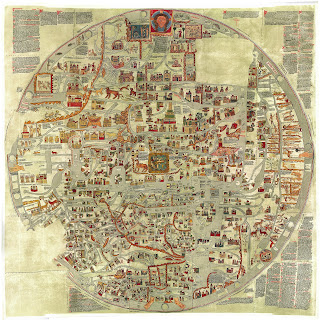 |
| 1. Erbstorf Mappamundi, 12th Century |
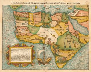 |
| 2. Germany, 1544 |
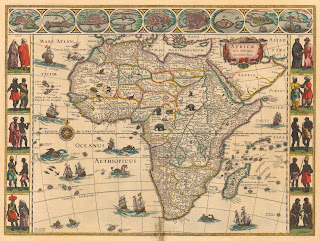 |
| 3. Netherlands, 1644 | | | | | |
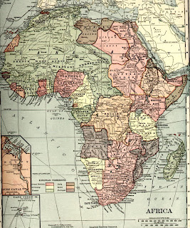 |
| Britain, 1910 |
| 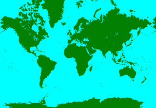 |
| 4. Mercator Projection Map |
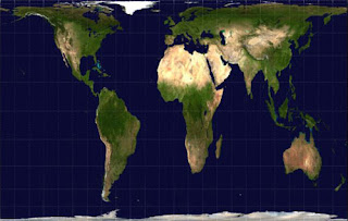 |
| 5. Gall-Peters Projection (correcting for earth's curvature) |
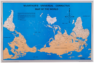 |
| 6. McArthur's Corrective Map |
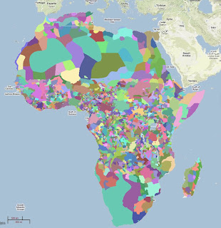 |
| 7. Ethnic Diversity of Africa |


20 comments:
The size and shape of Africa in each map is different. Maps 5 and 6 show not only Africa but the rest of the world. This shows us Africa's size compared to The countries we are more familiar with like North America. However, these are also "correcting" maps so they're relatively different from the world maps we're used to seeing. I find it interesting that map 6 is up side down. My old math teacher once told me that if you turn a map upside down it would be more accurate. He said that American maps make America look bigger than it is and center it, cutting europe it half because they want America to seem like the center of the world. Looking at all these maps makes me feel like I can't trust any one of them because I don't know which one is right. I would be happy with a satellite picture.
I think Map 3 supports the single story that Africans are not very developed and they were' with the times. In the pictures on the sides they show Africans with sticks and skirts.
-sabrina
Maps not only shape but the also reflect our understanding of the world. They show us how much we know about the world not only in terms of geography but because of the various ways to depict a map, they tell us how much we know about the world. The map from the 12th century shows how little people knew but also how much they thought they knew. Asia and Africa are both on the very edges of the map whereas Europe is sprawled out on the map. That map is a very Euro-centric map that clearly says that Europe is the most powerful and important continent on the map.
Map 7, the Ethnic Diversity of Africa, obliterates the "single story". It shows that there is so much more to Africa than the stereotypical village. There is so much more diversity and culture in Africa than people think.
That last one was Kennedy, whoops!
The continent of Africa is shaped differently in all these maps and this reflects on the idea of why so many of us have depicted Africa the way we do;as this medium size place of not much importance which is over populated, has tons of animals, and is surrounded by massive amounts of water. The fact that people who make/print these maps and make Africa seem way smaller than it actually is, is absurd. This tells us that the world relates size to power. Countries that are the center of attention on maps are the same ones that are publicly spoken about more and it gives them all kind of power. This is exactly what "the single story" is about. Africa is neglected by others around the world because it is not in the media often and this leads to ignorance of the people. - Nicole Meza
A map makes up the visual aspect of a single story. If one was to look at the Mercator Projection Map they would believe that Africa does not stand out and is relatively the same size as South America and the US. This is beyond inaccurate and it paints a picture that Africa is not as big and important of a continent then it is. In the Gall-Peters Projection map, which proves to be more accurate because it factors in the earth's curve, Africa is depicted at its actual size. This tells a story that Africa is definitely something to pay attention to and that is of importance. Size is power. It's interesting to me that one can tell a single story of their own power by enhancing their piece of land's size.
-Lena
All of these maps here depict Africa in many different ways. Some have depicted it as rather smaller than some of the other countries, but others have depicted it as large and one of the biggest countries on the map. This shows how people view Africa in different ways. People have either seen it as less important and should be shown small, and others have seen it as a big factor in the world, and have made it seen as the biggest country with the largest population. A lot of people also feel that because Africa is not shown or heard about in the news often, they feel that Africa should not be a big part of the world, which in reality, it is.
In map 4, the Mercator Projection Map, Africa is depicted as not as big as it should be, and in map 5, the Gall-Peters Projection map, Africa is seen as very large and taking up most of the space.
-Emma
What I find interesting about these maps are the similarities and differences between all of them. On one hand they all have Africa represented at least in a portion of the map but in certain maps Africa plays a more prominent role than in others either because of its size, such as in the Gall-Peters Projection or its place on the map such as in map 6 because it is at the top or even because of its diversity which is shown in map 7. This shapes our understanding of the world because if we are shown only the first map than we might think that Europe is more important than Africa because of its placement on the map and if we are shown the Mercator Projection Map we might think that Europe, Asia and North America play a bigger role in the world because of their size compared to the other continents. Maps can shape our understanding of Africa in the same way because if we were shown the second map we might think that Africa is filled with crazy monsters when it really isn't. Also the Mercator Projection Map gives the impression that Africa is not a very important place because of its size, but map number 7 illustrates that Africa is important because of its big diversity. The single story can be reinforced by looking at maps like map number 2 because it shows crazy monsters and animals which might make people believe that those are the only things that live there. Maps only show one point of view not many different ones.
The Mercator Projection map makes people believe that Africa is much smaller than it really is and it seems like it wouldn't have a big impact on the world. But map 7 shows how diverse Africa is and it tells us that Africa is more important than other maps make it out to be.
-Maddy
The two maps I find most interesting are the 12th century map, and the modern Gall-Peters Projection. The 12th century map is very ornate, and includes all sort of plants and animals, while the Gall-Peters is very plain and factual. The Gall-Peters Projection shows all the continents as they actually are, while the 12th century map focuses almost entirely on Europe, while still being a "world map". As a result, the 12th Century map is much more conducive to a single story, since it focuses only on one area, while making everything else look strange and small.
~Ben
Maps 2 and 4 both show how the idea of power can lead a mapmaker askew, and not show the truth of the land. In #2 they show things like mountains in upper Africa, and obviously people believed that. And then the more modern map, #4, people still believe to this day that the world is shaped like this, that Africa is smaller than Greenland, that Alaska is bigger than Mexico. And what can Africa do about this? Not much, because they have never held the power or the influence to show the truths of how the world is shaped. It reflects how people believe this single story of the shape and size of Africa, and how people still today are shocked when they see a true map of the world and they realize how large Africa is.
-Will
A map is a diagram that represents an area of land or sea etc. All of the maps listed have one thing in common; they all have their own representation of Africa. In the first map, that was created in the 12th century we see that the Europeans didn’t think much of Africa (being that even though it’s the second largest continent it’s only placed as a small sliver of the map). As both time and the maps progress we start to see Africa make it’s way to the center of maps. In the map that shows the different ethnic groups of Africa we can see how far Africans have come from the times of when the Europeans colonized them.
-DeAndra
I think the McArthur’s Corrective Map is really interesting because, although it is the same map, it seems wrong to us. In reality, there is no up and down for the planet. Why is North America above South America? Why is Europe above Africa? Why is Africa in the middle of the map and Australia is in the corner? Just because the McArthur’s map is from a different perspective, why do we perceive it as wrong? I think that having an official world map that is always from the same perspective does reinforce the single story. Our eyes are drawn to certain landmasses because of their position, and we may subconsciously start thinking certain things about them. For example, Antarctica is bigger than Australia, but since Antarctica is at the very bottom of the map, most people probably don’t even notice it. On the other hand, I think that the Ethnic Diversity map goes against the “single story.” Many people think of Africa as one country, and think that all the people are all the same. This map displays how many different Ethnic groups are in one continent, and that the single story of Africa does not fairly represent all the different kinds of people that live there.
-Olivia
Looking at the first map, 1. Erbstorf Mappamundi, 12th Century you can see the little knowledge that people had of the geography of the world. We can tell that Jesus played an important role in that period, because according to what the map displays, he is the world. At first glance, it seems like a town because of how detailed it is and how nothing is identifiable or separated and everything looks as though it is interconnected. It was nearly impossible to find Africa, which reveals that people both lacked an image and understanding of Africa’s geography and identity as well as the rest of the world. It only shows a Christian’s perspective and does not display any other points of view, reinforcing “the single story” aspect.
The last map, 7. Ethnic Diversity of Africa in contrast to the first map shows a completely different perception of Africa. This map is far more accurate than the first, because not only does it show and identify clearly what each country is, but it also shows all of the different ethnic groups. The color variations throughout the continent symbolize the great range of ethnic groups. Where the first map did not even clearly show Africa because the whole image was so detailed from a bird’s-eye-view, the last map highlights the borders and boundaries with in the great number of countries in Africa.
In all maps, size, shape and placement can give all people a perspective of how the world is shapes, and who is the most powerful. In map 4, Africa is so small and it is not in the middle like it is in map 5. Africa is 3x the size of United states. In map 4, they look about the same, this is greatly off. Yet in map 5, Africa looks much bigger than United states like it is in real life. Also in map 4, Africa looks a tiny bit larger than South America, but it is actually 2x the size. In map 5, it is the the total opposite Africa looks so much more larger than South America, also Europe looks like a reasonable size. In map 4, Europe looks bigger than all the other continents combines. In map 4, the single story shows how Europe and Greenland are much more powerful than other countries. In map 5, the story shows how as a continents how powerful Africa actually is, it is superior compared to everything else.
-Richie
Each map is unique and shows a different perspective from different centuries. As we stated in class that map # 4 is inaccurate. It shows Africa being the same size as the U.S. which is false. Also in map #5 you can see that the show the world puzzle-like. As if all of the continents started together, with Africa in the center and the others surrounding it. Map #7 still amazes me. I would've never thought that there is that many ethnic groups in Africa. I just don't understand map #1 and doubt that is even a "map" because it sure doesn't look like one.
Chris
Looking at all of these maps is really interesting. They all depict the world differently because as time went on, people learned more about how the world was shaped. Looking at the ones from earlier times, its so different from what we know today and it's almost disorienting because you are not sure what is what. It's interesting to see how they create the maps. Whether they put pictures in the map or keep it more simple. It also shows us how they thought of the world by looking at where each country is located.
Even though we could think that maps are just pictures, I think that they can really shape our understand of the world and how we conceive different countries. Maybe we don't notice it but depending on how big a country is depicted, we could think, probably subconsciously over generations and generations, that one country is better or worse than others. For example, in the Mercator Projection Map, they make certain countries larger than others. Africa is shows only slightly bigger than the US, and South America seems the same size as Greenland. These sizes are incorrect so therefore they shape our understanding. Not only because it is the wrong proportions but because it could give someone the idea that one country is perhaps not as special or important as another country, of course, subconsciously. Africa is also just thrown in the middle. It is kind of just there. But with the Mercator Projection Map we can see the accurate proportions and sizes. And we can see that Africa is MUCH bigger and takes up way more space. The US is much smaller. And now that we have the correct data, it can also shape our understanding of the world. Since we often associate size and power, we can understand the power and diversity of Africa and the world. All of these maps relate to the idea of "the single story" and definitely create that idea because what we see is what we think of. And if we only have one and people only see a certain map, that is what they will think of and their idea of the world will be different. And again, with Africa, people might subconsciously have a wrong idea of not only the size but it's worth compared to other places. These maps can teach a lot. --Tristan
Map #1 really reflects the single story, the world from which the conquering map makers came. It does not do Africa any justice. It makes the magnificent continent just look like one big marketplace. It does not show the diverse and endlessly different Africa that we know. It is evident that religion played a huge role in the making of this map- we even see our good friend Jesus. While the more sophisticated, Britain's map of 1910 shows an Africa divided up between European countries with England having the major share of the loot. Or maybe France has a little bit more. It's hard to make it all out. But this is still the single story even though it is centuries later. It's still Africa seen through European eyes and it is Africa seen as a resource, not as its own world.
- Myles
As we discussed in class, countries and their perspectives of themselves sometimes sways the look of there maps, and this ultimately shapes our outlook on the world and specifically significance. In Map 1, there is a heavy christian influence in this map, this is exhibited by the head, hands and feet of Jesus Christ. I find it extremely interesting that there are buildings,people and animals drawn in this map. What I noticed about Map 1 is that it seems to create the single story of Africa regarding its insignificance. In this map Africa is drawn on the right side of the map and doesn't in any way take up a substantial amount on the map. This may have been the start of looking at Africa as insignificant and not much of a force. This map may have started the single story of Africa not being that big. This is interesting because some Europeans saw Africa as insignificant yet they relied on Africans heavily for slavery. Slavery also may have a bearing on peoples understanding of Africa. However, in Map 5 Africa's vastness is shown proportionally. With the Gall-Peters Projection people can actually see how vast big Africa is. This may get rid of the single story of Africa, in not being that large. This map might change the single story of Africa and it may change many peoples view of Africa and their significance.
-Izzy
Looking at the differences between maps 1 and 7 I notice as you go further down the list you can see more details and observations. At the top of the list I noticed that the maps lacked detail or believable substance when compared to the maps lower on the list. To be more specific map 1 and map 7. I believe that the detail difference is due to the technological advances that the people who made map 7 had.
Last one was Eugene
some of the maps seem really abstract and difficult to follow, and others seem to not be very drawn to scale. maps shape our understanding of the world because they are our perception of where the countries are and which is the biggest, therefore being the most important or powerful. Africa is made in incorrect proportion to other countries in some maps so it seems as if it isn't very important, is not very powerful and doesn't have a lot of meaning to the world. They can create and/or reinforce "the single story" because of the way certain maps show the size of the country, which may form some sort of belief of a lower or higher social status. -shaun
Post a Comment